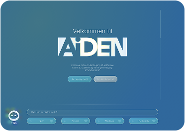
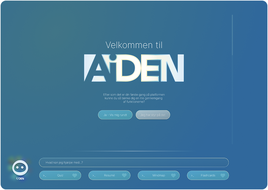
I joined Manifold AI as a UI/UX designer, and one of my tasks was to design the web UI for our agents — the surface end users meet when they work with an agent, across dashboard, conversation, report generation and onboarding, plus the design system holding it together.
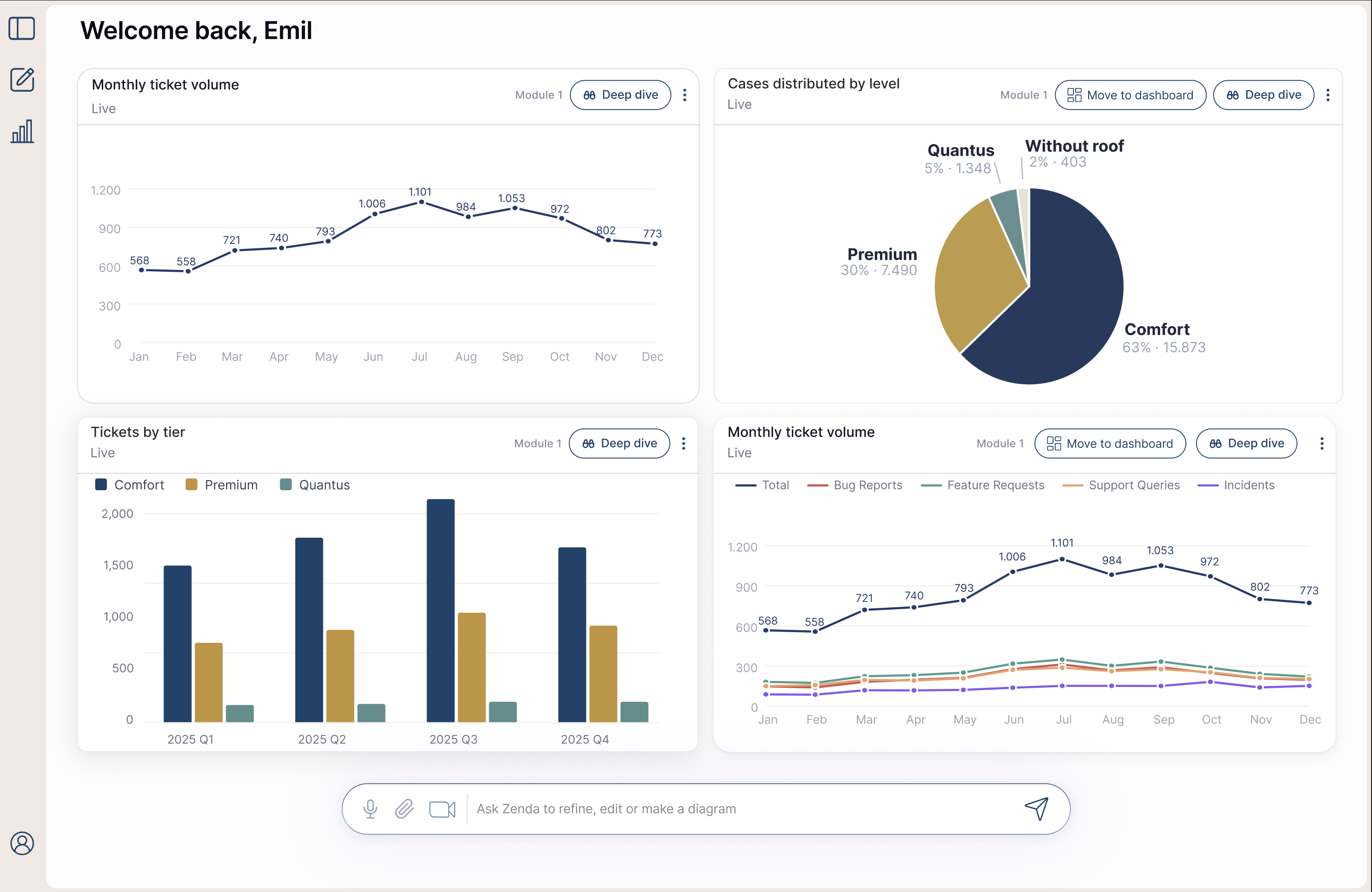
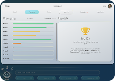
The screens shown here are from a customer case where the agent's job was to keep track of the customer's own data: reading it, structuring it, turning it into reports, and letting each user build a personal dashboard of the things they cared about.
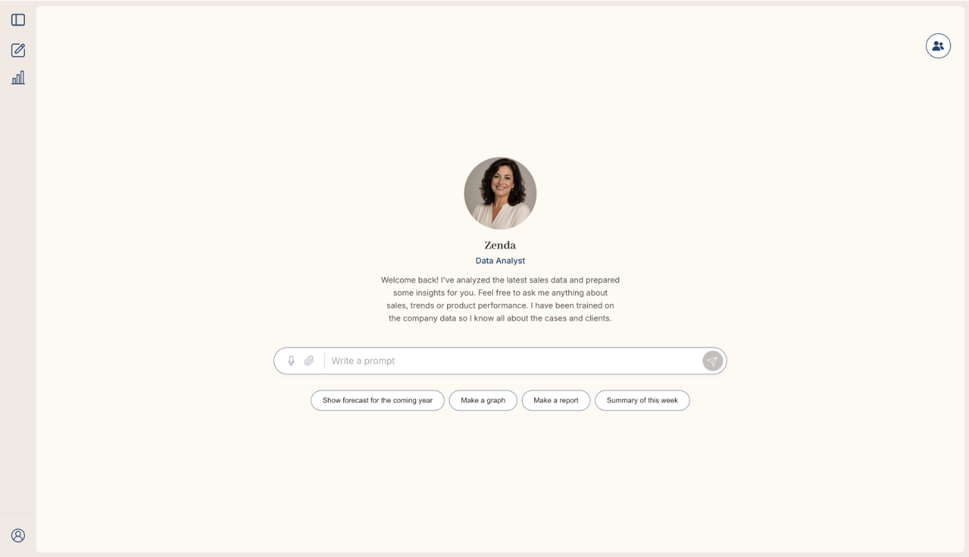
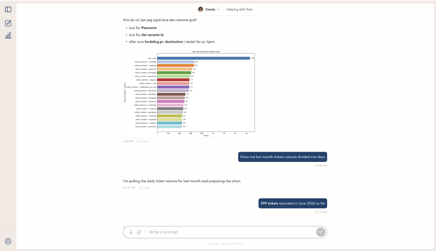
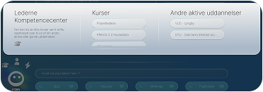
The guiding principle was that everything happens through conversation. No filter rows, no settings panels, no dropdowns. It sounds simple, but it's harder to design, because when you remove the controls, everything the controls used to tell the user has to live somewhere else — what the system can do, what it's looking at right now, and how you change it. Reports were the clearest version of that: a report is a frozen document you can't click into and edit, so you change it by asking. The interface has to make it obvious what's editable, what's already been asked for, and what the agent didn't understand.
The most interesting part was the work on trust. Polished charts make people trust the numbers more than the numbers deserve, and when part of the basis is inferred by a model, that's a real problem. So the visualisations always show how much of the underlying data they cover, and colour must never signal good or bad. No red and green. You should read the number, not the colour.
The dashboard has been handed off to development, and the reporting flow is designed and being detailed.
I joined Manifold AI as a UI/UX designer, and one of my tasks was to design the web UI for our agents — the surface end users meet when they work with an agent, across dashboard, conversation, report generation and onboarding, plus the design system holding it together.
The screens shown here are from a customer case where the agent's job was to keep track of the customer's own data: reading it, structuring it, turning it into reports, and letting each user build a personal dashboard of the things they cared about.
The guiding principle was that everything happens through conversation. No filter rows, no settings panels, no dropdowns. It sounds simple, but it's harder to design, because when you remove the controls, everything the controls used to tell the user has to live somewhere else — what the system can do, what it's looking at right now, and how you change it. Reports were the clearest version of that: a report is a frozen document you can't click into and edit, so you change it by asking. The interface has to make it obvious what's editable, what's already been asked for, and what the agent didn't understand.
The most interesting part was the work on trust. Polished charts make people trust the numbers more than the numbers deserve, and when part of the basis is inferred by a model, that's a real problem. So the visualisations always show how much of the underlying data they cover, and colour must never signal good or bad. No red and green. You should read the number, not the colour.
The dashboard has been handed off to development, and the reporting flow is designed and being detailed.